
Website Design Mistakes Killing Your Sales: 12 Costly Errors to Avoid
A website can either help your business grow or quietly push visitors away. When the design is confusing, slow, or outdated, people often leave before they ever contact you. That is why website design mistakes killing your sales can become such a serious problem.
Good design is not only about looking attractive. It should guide visitors, build trust, and make it easy for them to take action. If your website fails at those things, your sales can suffer even if your product or service is strong.
Website Design Mistakes
1. Slow loading pages
If a website takes too long to load, many visitors will leave before it even appears. Speed affects both user experience and conversions. A slow site often creates a bad first impression right away.
Large images, weak hosting, and too many scripts are common causes. Fast websites usually keep more visitors engaged and ready to explore further.
2. Confusing navigation
When people cannot find what they need quickly, they get frustrated. Clear menus and simple page structure help users move through the site easily. Confusing navigation is one of the biggest website design mistakes.
Visitors should always know where to go next. If they have to think too hard, they may leave instead of buying.
3. Weak mobile design
Most users browse on phones, so a website must work well on smaller screens. If buttons are too small, text is hard to read, or pages break on mobile, the site loses credibility. This can directly reduce sales.
Mobile-friendly design is no longer optional. It is one of the basics of modern web design.
4. Too much clutter
A crowded page can overwhelm visitors. Too many colors, blocks, pop-ups, or messages can distract from the main offer. Clean layouts usually perform better because they make it easier to focus.
Your website should guide attention, not fight for it. Simplicity often converts better than visual noise.
5. No clear call to action
If visitors do not know what to do next, they often do nothing. Every important page should have a clear action like call, book, buy, or contact. Missing calls to action is one of the most costly website design mistakes killing your sales.
The button or message should be visible and easy to understand. A strong CTA helps turn visitors into leads or customers.
6. Poor homepage messaging
Your homepage should quickly explain who you are and what you do. If people need to guess, they may leave. A vague homepage creates confusion and weakens trust.
A strong homepage should answer the visitor’s basic questions fast. Clear messaging makes the rest of the site more effective.
7. Outdated design
An old-looking website can make a business seem less active or less trustworthy. Visitors often judge quality from appearance within seconds. An outdated design can reduce confidence before they read a single word.
Modern design does not mean flashy design. It means clean, current, and professional.
8. Weak trust signals
People want proof before they buy. If your website lacks testimonials, reviews, case studies, credentials, or contact details, visitors may hesitate. Trust signals help reduce that uncertainty.
A good website should make credibility visible. Without trust, conversions usually stay low.
9. Too much text
Long blocks of text can be hard to scan. Visitors usually skim first and read more only if something catches their attention. Dense pages often lose people quickly.
Short paragraphs, headings, and bullets make content easier to digest. Good formatting can improve both engagement and sales.
10. Low-quality images
Blurry, generic, or poorly sized images can make your site look unprofessional. Since design is visual, weak images can damage credibility fast. This is a common problem on many business websites.
High-quality visuals help people understand your brand better. They also make the site feel more polished and trustworthy.
11. No SEO structure
A website that looks good but is not structured for search may still fail to attract visitors. If titles, headings, and page organization are weak, search engines may not understand the content well. That means fewer people reach the site in the first place.
SEO and design should work together. A sales-focused website must be easy to find as well as easy to use.
12. Hard-to-find contact details
If people want to contact you but cannot easily find your phone number, form, or location, you may lose the lead. Contact information should be visible on every important page. Hiding it too deeply is a major mistake.
Visitors should be able to reach out without searching for too long. Easy contact options improve conversions.
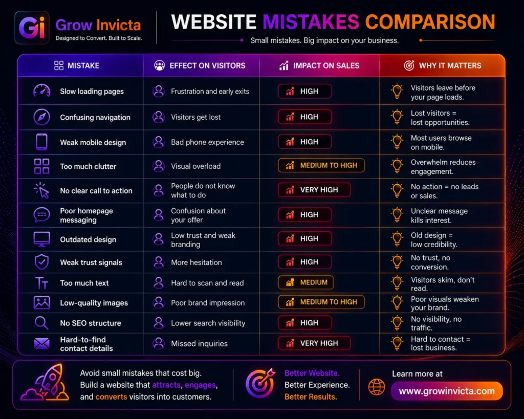
Comparison Table (Website Design Mistakes)
Website Design Mistakes
Final Thoughts
Website design mistakes killing your sales usually come from poor clarity, weak trust, and bad user experience. Even small issues can make a big difference if they stop visitors from taking action. The good news is that most of these problems can be fixed.
A strong website should be fast, clear, mobile-friendly, and easy to trust. If your site helps visitors understand your offer and contact you quickly, it has a much better chance of turning traffic into sales.
Website Design Mistakes
Frequently Asked Questions
1. What are the biggest website design mistakes?
Slow pages, poor mobile design, confusing navigation, and weak calls to action are among the biggest problems.
2. How do website design mistakes affect sales?
They make visitors leave, lose trust, or fail to contact you.
3. Why is mobile design important?
Because most users browse on phones, and a bad mobile experience can reduce conversions.
4. Do trust signals matter on websites?
Yes, testimonials, reviews, and credentials help people feel more confident.
5. Can a good design improve SEO?
Yes, structure, readability, and performance all support search visibility.
6. Why do images matter so much?
They shape first impressions and affect how professional your site looks.
7. Should every page have a call to action?
Yes, visitors should always know the next step.
8. Can small design fixes improve sales?
Yes, even small improvements can make the site easier to use and more effective.